


How to Structure Your Nonprofit Website for Multiple Funding Streams Without Confusing Donors


Key Takeaways
A nonprofit website should not make every supporter follow the same giving path. Different funding streams usually need different levels of visibility, context, and calls to action.
M+R’s 2025 Benchmarks found monthly giving now makes up 31% of online revenue, while donor-advised fund revenue also increased in 2024. That means many nonprofits need a website that supports more than one type of gift more intentionally.
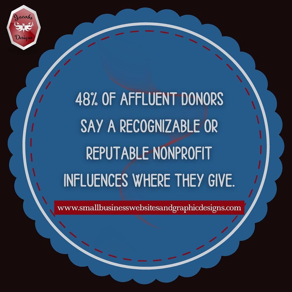
Giving USA’s summary of the 2025 Bank of America philanthropy study says nearly one in four affluent households use a giving vehicle, and among households worth $5–$20 million, 48% either have or plan to establish one within the next three years. That points to a more complex donor environment than a single generic donation page can support well.
A better nonprofit website structure does not mean more clutter. It means clearer paths for recurring donors, major donors, grant-related trust-building, and other giving options.
The goal is not to build a huge sitemap. It is to make the important donor journeys easier to understand and easier to act on.
Table of Contents
A Diversified Funding Strategy Needs A More Intentional Website Structure
Why This Topic Matters More Now
What Multiple Funding Streams Actually Means On A Nonprofit Website
The Biggest Website Mistake Nonprofits Make
What A Better Website Structure Looks Like
How To Structure The Homepage When You Support Multiple Giving Paths
How To Create Clearer Paths For Different Donor Types
Where Trust-Building Pages Fit Into A Multi-Stream Website Structure
How To Keep The Website From Feeling Cluttered Or Confusing
A Simple Website Structure Small Nonprofits Can Start With
👉A Diversified Funding Strategy Needs A More Intentional Website Structure
A lot of nonprofits say they want multiple funding streams, but their website still acts like every supporter should take the exact same path.
That is usually where the confusion starts.
The organization may want recurring donors, major gifts, grant credibility, campaign support, donor-advised fund gifts, maybe event revenue too — but online, everything still points back to one general donation page. That is not really a multi-stream fundraising website. It is one giving path trying to do too many jobs at once.
From where I sit as a small business owner who designs websites and marketing graphics for nonprofits and small businesses, this is one of the clearest examples of strategy and website structure getting out of sync. The fundraising goals may have evolved, but the website often has not caught up yet.
A lot of nonprofits are not just dealing with a fundraising problem. They are dealing with a bigger website clarity problem at the same time. I talk more about that in The Biggest Digital Challenges Nonprofits Face and How to Fix Them.
📌Why This Topic Matters More Now
This matters more now because fundraising is getting more layered, not less.
M+R’s 2025 Benchmarks found that monthly giving made up 31% of all online revenue in 2024, while overall online revenue rose 2%. M+R also found that donor-advised fund revenue increased 6% in 2024, and nonprofits raised an average of $0.13 through DAFs for every $1 raised online. That is a pretty strong sign that nonprofits are not just dealing with one kind of digital gift anymore.
At the same time, Giving USA’s summary of the 2025 Bank of America philanthropy study says nearly one in four affluent households use a giving vehicle, and among households worth $5–$20 million, 48% either have or plan to establish one within the next three years. That means many serious donors may be thinking in terms of DAFs, family foundations, and more strategic giving paths — not just clicking a one-time donation button.
So the website challenge becomes pretty obvious: if donors are arriving with different levels of intent and different ways they want to give, the site needs to make those paths clearer.
💻What Multiple Funding Streams Actually Means On A Nonprofit Website

When I say “multiple funding streams,” I do not mean a nonprofit needs a giant menu with every possible financial category crammed into it.
I mean the website should support the real ways support happens.
That might include:
one-time online giving
recurring giving
major gifts
grant-related trust and credibility
donor-advised fund gifts
campaign support
event fundraising
peer-to-peer or community fundraising
sometimes sponsorships or earned revenue, depending on the organization
The website does not have to give each of those equal visual weight. But it should make the important ones clear and findable.
That is the real difference between a site that supports funding diversification and a site that only says it does.
❌The Biggest Website Mistake Nonprofits Make
The most common mistake I see is this:
Trying to make one donation page do everything.
It is understandable. Small teams are busy. One page feels simpler. But externally, it usually creates more friction.
When every donor gets pushed through the same path:
recurring giving gets buried
major donors get too little context
campaign traffic lands somewhere too generic
trust-building pages stay disconnected
the donor journey feels flatter than the fundraising strategy actually is
A stronger fundraising system usually needs more than one core asset, because one page cannot carry every donor decision equally well. I go into more detail in my post Digital Fundraising Assets Every Nonprofit Needs.
⚖What A Better Website Structure Looks Like
A better structure is not necessarily a bigger structure.
It is a clearer one.
Here is what that usually looks like:
Website Area | What It Supports |
Homepage | Main giving paths and overall priorities |
Main Donate Page | General giving conversion |
Recurring Giving Page or Section | Monthly donor path |
Major Donor Landing Page | Larger gift confidence and next step |
Impact Page | Trust, outcomes, and case for support |
Reports / Transparency Page | Grant and donor credibility |
Campaign Pages | Time-sensitive or specific fundraising appeals |
Contact / Ways to Give Page | Strategic giving conversations and alternative options |
That does not mean every small nonprofit needs every one of these fully developed on day one. But this kind of structure gives you a much better framework than one catch-all donation path.
Larger gifts usually need a more intentional page experience than a standard donation form provides. If your nonprofit wants to support bigger donor decisions more clearly, How to Create Landing Pages for Major Donors is a helpful next read.
🎯How To Structure The Homepage When You Support Multiple Giving Paths
Your homepage should not try to fully explain every funding stream.
That is one of the easiest ways to create clutter.
But it should help visitors see that there is more than one way to support your work.
A better homepage usually does three things:
introduces the mission clearly
highlights the most important giving paths
moves people toward the next logical page
So instead of trying to explain every giving option in full on the homepage, you might surface shorter pathways like:
Donate
Give Monthly
Major Giving
Ways to Give
Our Impact
That is enough to guide people without overwhelming them.
If your nonprofit is still deciding which giving path deserves the most visible support on the homepage, Grants vs Recurring Donations: What Your Website Should Support First can help clarify that priority.
✍How To Create Clearer Paths For Different Donor Types
This is where the strategy gets more donor-centered.
Not every supporter is making the same kind of decision, so the site should stop acting like they are.
You may be speaking to:
a one-time donor ready to give quickly
a supporter interested in monthly giving
a major donor prospect
a funder or grant reviewer checking credibility
a donor who wants to give through a DAF or other vehicle
Each of those people may need different levels of information, different proof points, and different next steps.
That does not mean you need a separate microsite for every one of them. But it often does mean you need:
different pages
different calls to action
different navigation paths
and clearer “ways to give” structure
The goal is not more pages for the sake of more pages. It is better paths for people making different decisions.
💡Where Trust-Building Pages Fit Into A Multi-Stream Website Structure
This is one of the most overlooked parts of the whole website.
Trust-building pages are not just “nice extras.” They support almost every funding stream you care about.
That includes pages like:
impact and outcomes
annual reports
financial transparency
board or leadership information
donor stories
program results
Giving USA’s summary of the 2025 Bank of America philanthropy study found that 93% of affluent households are more likely to give when they believe their contribution will make a difference, and 62% monitor impact before making another gift. So if your website is trying to support recurring donors, major donors, and even grant credibility, trust pages are doing real fundraising work.
This is also where design and structure start overlapping. If these pages are hard to find, disconnected from donation paths, or buried in a confusing menu, they do not do their job very well.
💭How To Keep The Website From Feeling Cluttered Or Confusing
A lot of nonprofits worry that supporting multiple funding streams will make the site feel messy.
It does not have to.
Usually, clutter happens when pages are added without a clear hierarchy.
A cleaner structure usually means:
one clear homepage message
a few top-level paths
clean menu labels
less duplication
better internal links
fewer pages trying to say everything at once
Website structure is not only about what pages exist. It is also about what is emphasized visually, what feels easy to follow, and what kind of confidence the site creates.
A website can support multiple funding streams without looking busy. But it has to be based on clarity, not accumulation.
📗A Simple Website Structure Small Nonprofits Can Start With

Most small nonprofits do not need a complicated architecture first.
They need a structure that makes the most important giving paths easier to follow.
A realistic starting point often looks like this:
Homepage
Donate page
Recurring giving page or section
Impact or results page
Major donor page
Reports / transparency page
Campaign pages as needed
That is enough to create more structure without making the site feel bloated.
You can always expand later. But even that basic setup does a much better job supporting multiple giving types than sending everyone into the same generic path.
🌟Conclusion About Funding Streams
If your nonprofit says it wants diversified revenue, your website should not make every donor take the same road.
That is really the simplest way to say it.
A better website structure does not mean more complexity for the donor. It means less confusion.
It means:
clearer giving paths
clearer priorities
clearer trust signals
and a site that reflects the range of support your organization is actually trying to grow
For a lot of nonprofits, the next level of fundraising is not going to come from one more appeal alone.
It is going to come from a website that makes different kinds of support easier to understand and easier to act on.
✨FAQS About Funding Streams
What Does It Mean To Structure A Nonprofit Website For Multiple Funding Streams?
It means organizing the site so different kinds of support — such as recurring giving, major gifts, general donations, and trust-building for grants or sophisticated donors — have clear, intentional paths.
Does Every Funding Stream Need Its Own Page?
Not always, but important funding paths usually need more than one general donation page to support them clearly.
How Can Nonprofits Avoid Confusing Donors With Too Many Giving Options?
By prioritizing the most important paths, using clean navigation, and giving each key donor type a clearer route instead of flattening everyone into one catch-all page.
Should A Nonprofit Homepage Mention More Than One Giving Path?
Usually yes, but selectively. The homepage should introduce key options without trying to explain everything in one place.
What Pages Matter Most For A Multi-Stream Fundraising Website?
A clear donation page, recurring giving support, trust-building pages, and any distinct path needed for major donors or strategic giving options.


Comments