


How to Design a High-Converting Monthly Giving Page That Increases Nonprofit Revenue and Donor Retention
- Jacobs Branding Graphics & Website Designs

- Mar 23
- 11 min read
If you’re a nonprofit leader, development director, digital fundraising manager, or marketing strategist, you’ve probably felt this: you run a campaign, you bring in a wave of first-time donors… and then the list goes quiet.
Not because your donors stopped caring — but because the relationship never really got built.
Here’s the transparent truth: most organizations are designed to win the first gift, not the second. And the second gift is where sustainability starts.
Let’s break down why first-time donors don’t give again, and exactly how to fix it with a practical nonprofit digital strategy focused on donor retention.

Key Takeaways
Monthly giving is already a major digital revenue driver—in 2024 it accounted for 31% of all online nonprofit revenue in M+R Benchmarks data.
First-time donor retention is still painfully low in sector-wide benchmarking—some FEP reporting shows new donor retention around 14% year-to-date (unadjusted).
A dedicated monthly giving landing page consistently outperforms a “make it monthly” checkbox because it can sell the why, the impact, and the identity.
Recurring giving tends to be monthly: one Blackbaud industry explainer cites 94% of recurring donors prefer to give monthly.
Your monthly donation page design is not “nice-to-have branding”—it’s conversion infrastructure (clarity + trust + momentum).
Donor loyalty improves when recurring giving feels like belonging (“Impact Partners,” “Sustainers Circle”), not a billing setting.
Small conversion gains can create big stability: improving monthly donor conversion by a few points can add meaningful annual baseline revenue without increasing acquisition.
Consistent donor communication matters: NextAfter reports a test where more consistent communication drove a 41.5% increase in revenue.
Table of Contents
The Checkbox Problem: Why Monthly Giving Pages Matter
Why Monthly Giving Increases Nonprofit Revenue
Why Monthly Giving Builds Donor Loyalty
Why Most Monthly Donation Pages Don’t Convert
What to Include on a Monthly Giving Landing Page That Converts
Nonprofit Recurring Donation Page Design Tips (UX + Trust)
How to Convert One-Time Donors to Monthly Donors
Revenue Modeling: What Even a Small Lift Can Do
Implementation Checklist and Content Map
✅The Checkbox Problem: Why Monthly Giving Pages Matter
I’m going to be candid, in the way I’m candid with my own clients.
I design websites and social media marketing graphics for small businesses and nonprofits. When a nonprofit tells me, “We want to grow monthly giving,” my first question is almost always:
“Where is your monthly giving page?”
And the most common answer is… awkward silence.
Because what they really have is a general donation page with a tiny toggle that says:
“Make this a monthly gift.”
That’s not a strategy. It’s a feature.
If you’re an executive director, development director, digital fundraising manager, or marketing/communications lead, here’s why this matters: people rarely commit to recurring support unless they understand what they’re joining.
A monthly gift isn’t just a donation decision—it’s a relationship decision.
So this post is going to do two things:
Explain how monthly giving increases nonprofit revenue and stabilizes fundraising
Show you how to create a monthly giving page for a nonprofit that improves donor retention and donor loyalty—without feeling pushy or gimmicky
📆Why Monthly Giving Increases Nonprofit Revenue

Let’s start with a simple truth: recurring revenue isn’t just a “nice financial model.” It’s a stress reducer.
When your revenue is mostly one-time gifts, you get:
Peaks during campaign seasons
Valleys that create panic
Pressure to constantly “go back out” with another appeal
A system that feels reactive instead of planned
Monthly giving changes that. It creates a predictable baseline that makes planning possible.
The big data point to anchor your case
M+R Benchmarks found that monthly giving accounted for 31% of all online revenue in 2024, and monthly giving revenue rose year-over-year while one-time giving was flat in their reporting.
That tells us two things:
Monthly giving isn’t a side category anymore—it’s a core digital channel
Donor behavior is trending toward “subscription-style” support, especially online
What monthly revenue actually changes inside an organization
For leadership and boards, revenue stability is often the difference between:
hiring slowly vs freezing hiring
expanding services vs cutting programs
being proactive vs being permanently in crisis mode
A recurring revenue model for nonprofits doesn’t remove the need for campaigns. It makes campaigns less existential.
A quick “baseline” illustration
Monthly Donors | Avg Monthly Gift | Monthly Baseline | Annual Baseline |
100 | $20 | $2,000 | $24,000 |
250 | $25 | $6250 | $75,000 |
500 | $30 | $15,000 | $180,000 |
1,000 | $35 | $35,000 | $420,000 |
Even the “small” baseline becomes meaningful quickly—especially for small to mid-sized nonprofits.
That’s the revenue story. Now let’s talk about the loyalty story.
🤝Why Monthly Giving Builds Donor Loyalty
People don’t become loyal because they clicked a checkbox. They become loyal because they:
trust you
understand the impact
feel connected to the story
feel like their support matters over time
Recurring giving creates the conditions for loyalty because it’s repeated commitment. It’s not one decision; it’s a series of micro-decisions that reinforce identity.
The retention backdrop (why loyalty is fragile right now)
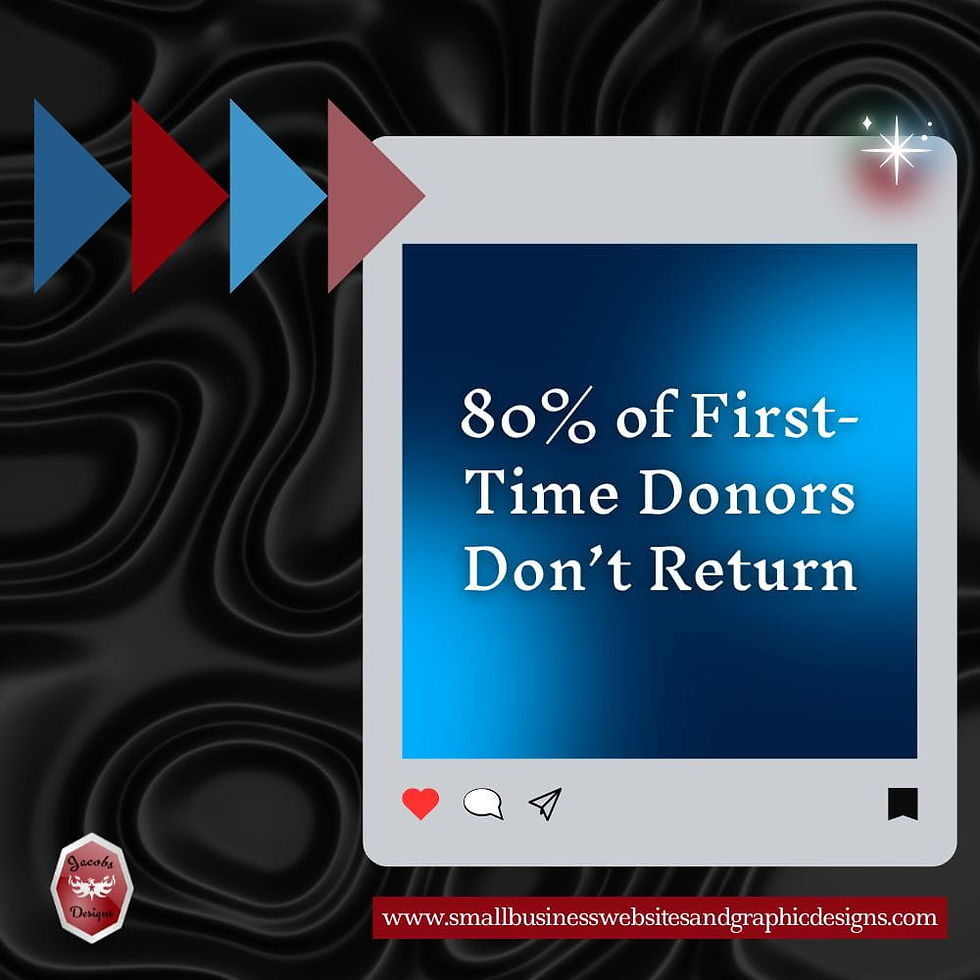
The Fundraising Effectiveness Project’s ongoing benchmarking continues to highlight the sector’s retention challenge. One FEP publication notes 14.0% of new donors from 2024 have been retained year-to-date (unadjusted for late data).
Even if your organization’s numbers differ, the pattern is real across the sector: first-time donor retention is the leak.
So monthly giving isn’t only about revenue. It’s also a practical response to the retention problem.
Why monthly donors tend to stick
Here are a few reasons recurring donors are often more loyal:
Reduced decision fatigue: they don’t need to decide “should I give again?” every time
Identity formation: “I’m a monthly supporter” becomes part of how they see themselves
More touchpoints: monthly donors are easier to steward because you can build a consistent communication rhythm
Impact continuity: recurring support maps naturally to “ongoing need”
Monthly giving is usually… monthly (and that matters for page design)
One Blackbaud explainer notes a strong preference: 94% of recurring donors prefer to give monthly.
That’s not just trivia—it means your digital experience should default to monthly-first framing (with transparency), because that’s the behavior many recurring donors already prefer.
💻Why Most Monthly Donation Pages Don’t Convert
Now we get into the practical, “I build this stuff” perspective.
If you’ve ever wondered why your recurring donation rate is low, it’s often not because donors are stingy. It’s because the page is doing none of the work required to earn a recurring commitment.
Here are the common failure points I see.
1) The page doesn’t exist (it’s just a toggle)
A checkbox is not a monthly giving landing page.
A landing page does three jobs:
Sells the why
Builds trust
Makes the action easy
A toggle only does #3—and even then, sometimes poorly.
If someone googles “best practices for nonprofit monthly donation pages,” they’re looking for a page structure and message—not a form setting.
2) The value proposition is unclear
Many pages never answer:
Why monthly?
Why now?
What does monthly support unlock that a one-time gift doesn’t?
Without that, donors assume monthly giving is mainly for your convenience.
Your page needs to frame recurring as impact continuity—not payment frequency.
3) The impact is abstract
If your monthly giving page says “Support our mission monthly,” that’s vague. People can’t picture the result.
High-converting pages translate monthly amounts into outcomes.
4) The page lacks identity and belonging
The best pages don’t sound like a billing portal. They sound like an invitation.
This is why names like “Sustainers Circle” work: they tell the donor they’re joining a group with shared purpose.
5) The UX feels outdated or stressful
A donor is deciding whether to trust you with an ongoing commitment. If your page feels clunky, slow, or confusing, you’re silently telling them:
“Don’t commit here.”
That’s why conversion rate optimization for nonprofits isn’t “marketing fluff.” It’s trust engineering.
🧠What to Include on a Monthly Giving Landing Page That Converts
This is the section most nonprofit teams want: a clear blueprint for what to include on a monthly giving landing page.
Below is a structure that works for small organizations and scales upward.
Monthly giving page anatomy (recommended order)
Headline + subhead
Value proposition (why monthly)
Impact ladder (what each amount does)
Story + visual
Social proof + trust
Donation form
FAQs + reassurance
“What happens next” stewardship promise
Let’s break that down.
5.1 Headline: Identity first, transaction second
Bad headline:
“Monthly Giving”
Better headline:
“Join the Monthly Community That Keeps [Impact] Happening.”
You’re not selling a recurring transaction—you’re inviting someone into a role.
5.2 Value proposition: explain why consistency matters
Use bullet points because leadership readers skim.
Example copy block:
Monthly partners make it possible to:
Keep services running between campaigns
Plan programs with confidence instead of crisis
Respond faster when needs spike
Reduce the cost and pressure of constant acquisition
That’s truthful and non-manipulative.
5.3 Impact ladder: show what monthly gifts do
This is one of the highest-leverage elements on nonprofit recurring donation pages.
Example table format:
Monthly Amount | What It Makes Possible | How to Phrase It |
$15 / month | Covers a specific, simple unit of impact | "Keeps one student supplied each month." |
$25 / month | Supports a repeating service | "Funds weekly support for a family." |
$50 / month | Enables deeper ongoing help | "Sustains counseling or case management." |
$100 / month | Anchors a program need | "Keeps a program moving forward." |
Two design tips:
Use whole, believable outcomes (donors hate inflated claims)
Keep the language simple—no program jargon
5.4 Story + visual: one person, one moment, one transformation
If you only add one “marketing” element, make it this.
A short story that answers:
Who was helped?
What changed?
What does ongoing support prevent or enable?
Keep it real. Donors can smell stock-photo storytelling.
5.5 Social proof + trust signals
Social proof reduces the fear of “am I the only one doing this?”
Examples:
“Join 312 monthly partners”
A short donor quote
A milestone (“Monthly supporters funded X sessions last year”)
Trust signals reduce the fear of “will I regret this?”
clear cancellation language
secure payment cues
privacy note
what receipts look like
5.6 The form: friction is the enemy of recurring conversion
This is where nonprofit website design for recurring donations becomes practical.
Form rules I recommend:
Keep fields minimal (name, email, payment)
Make the monthly option obvious and transparent
Use clear button text (“Become a Monthly Partner”)
Mobile-first layout (thumb-friendly spacing)
Make it fast—slow pages lose donors
5.7 FAQs: remove mental barriers
FAQ sections are not filler. They’re conversion tools.
Include at least these:
Can I cancel anytime?
Can I change my amount?
Is my payment secure?
Will I get updates on impact?
How do tax receipts work?
This is where you prevent hesitation from turning into abandonment.
5.8 “What happens next” promise (this builds loyalty)
Tell donors what they’ll experience after they join:
Thank-you email that feels human
Updates that show impact
A welcome series (your donor onboarding strategy)
Optional preference center (“tell us what you care about”)
📌Nonprofit Recurring Donation Page Design Tips (UX + Trust)
Let me talk like a designer for a minute.
A lot of nonprofits treat design like decoration.
But in fundraising, design is behavior shaping. It tells donors what matters, what’s safe, and what to do next.
Here are the highest-ROI recurring donation page design tips I see.
Make it feel like a landing page, not a subpage
Monthly giving should be presented like a program—so the page should feel like a program page.
That means:
single goal (join monthly)
minimal navigation distractions
clear sections and strong hierarchy
one primary CTA repeated thoughtfully
Mobile-first is non-negotiable
If the page is hard on mobile, you’re bleeding conversions.
Mobile best practices:
large buttons
limited scroll before “choose amount”
short paragraphs
avoid tiny text overlays on images
Keep the page emotionally warm
If everything looks cold and corporate, recurring giving feels like a bill.
Warmth comes from:
real photos
human language
transparent promises
gratitude that feels specific
Don’t hide the “cancel anytime” message
Some nonprofits hide this because they fear it will reduce sign-ups.
In reality, transparency increases trust—and trust increases recurring commitments.
👉How to Convert One-Time Donors to Monthly Donors
If you want to know how to convert one-time donors to monthly donors, the answer is: don’t push it
too early, and don’t treat it like an upsell.
Treat it like a next step for people who already care.
Conversion pathway options
A) Thank-you page prompt
After a one-time gift, add a section:
“Want to make this impact steady? Monthly partners keep [outcome] happening all year.”
This works because the donor is still emotionally engaged.
B) A 30-day onboarding sequence invite
After trust-building emails, introduce monthly giving as a community:
“Many supporters choose monthly giving because it creates consistent support. Would you consider joining them?”
C) “Milestone” moments
When you share an update (“we served 1,000 families this quarter”), include:
“Monthly partners are what make steady progress possible.”
Why consistent communication matters here
NextAfter describes an experiment where more consistent communication produced a 41.5% increase in revenue.
You don’t need to spam donors—but you do need to stop disappearing. Monthly giving conversion tends to rise when donors feel connected, informed, and appreciated.
✍Revenue Modeling: What Even a Small Lift Can Do

Let’s do some simple math. Not fancy projections—just practical “what would this change?”
Scenario: modest nonprofit, modest lift
Assume:
4,000 one-time donors per year
average one-time gift = $60
monthly conversion rate = 2%
average monthly gift = $20
Current monthly donors added per year: 4,000 × 2% = 80
Annual value of those monthly donors: 80 × $20 × 12 = $19,200
Now imagine your dedicated monthly giving page + onboarding improvements raise conversion from 2% to 3%.
New monthly donors: 4,000 × 3% = 120
Annual value: 120 × $20 × 12 = $28,800
Annual lift from a 1-point conversion gain: $9,600
And that’s year one.
If those donors stay, the value compounds.
Quick comparison table
Monthly Conversion | New Monthly Donors | Annual Baseline Added |
2% | 80 | $19,200 |
3% | 120 | $28,800 |
4% | 160 | $38,400 |
That’s why monthly giving pages are such a high-leverage digital fundraising strategy asset: you’re improving the value of donors you already acquired.
🗺Implementation Checklist and Content Map
Here’s a practical “do this next” list you can hand to a team—or use yourself.
Monthly giving page build checklist
Messaging
Name the program (Sustainers Circle / Impact Partners)
Write a clear “why monthly” value proposition
Build a simple impact ladder by amount
Add a short real story + photo
Add transparent FAQs (cancel anytime, receipts, security)
Add “what happens next” stewardship promise
Design / UX
Mobile-first layout
Clear hierarchy and scannable sections
Minimize distractions (reduce competing CTAs)
Fast page performance
Simplified form fields
Clear button text (“Become a Monthly Partner”)
Conversion pathways
Link to monthly giving page from donation confirmation
Add monthly invite to thank-you page
Add a monthly invite email in your onboarding series
Add a “monthly partners make this possible” line to impact updates
🌟Conclusion
If your monthly giving strategy is currently a checkbox on a generic donation page, you’re not alone—but you are leaving value on the table.
Monthly giving pages increase nonprofit revenue because they:
raise predictable baseline income
reduce dependence on seasonal spikes
improve donor lifetime value over time
They increase donor loyalty because they:
create identity (“I’m a monthly supporter”)
build consistency and trust
enable stewardship rhythms that keep donors connected
And here’s the most transparent part: you don’t need a massive budget to do this well. What you need is intentional design and honest messaging.
Start by building a dedicated monthly giving page that explains:
why monthly matters
what monthly gives accomplish
what the donor is joining
what happens after they commit
Then connect it to your onboarding and stewardship journey so that monthly giving isn’t a random toggle—it’s a natural next step.
That’s digital fundraising maturity. And it’s exactly how you move from “campaign stress” to “revenue stability.”
And if you’re looking at all of this thinking, “We don’t have the time or in-house skills to make these changes,” that’s where I come in. I help nonprofits and small businesses design and refine websites, donation pages, and social media marketing campaign graphics so that digital generosity isn’t blocked by bad mobile UX. In addition, I offer a visual brand identity service to make sure your branding is consistent across platforms. Reach out to me for more details, book a FREE 1 hour consult or fill out my new project form to get started.
✨FAQs
Do we really need a separate monthly giving page?
If you want meaningful growth, yes. A dedicated page lets you explain the program, build identity, show impact by amount, and remove friction—things a simple toggle can’t do. It’s one of the easiest wins in nonprofit landing page optimization.
What are the best practices for nonprofit monthly donation pages?
Clear identity-based headline, “why monthly” value proposition, impact ladder, real story + visuals, social proof, transparent FAQs, and a mobile-first, low-friction form. (In other words: clarity + trust + ease.)
Should we default the donation form to monthly?
Often, yes—but be transparent. Explain why monthly matters and make the one-time option easy to choose. Trust is more important than a short-term bump.
How do we convert one-time donors to monthly donors without being pushy?
Use timing and narrative: invite monthly giving on the thank-you page, after a short donor onboarding strategy sequence, and during impact milestones. Frame it as belonging and consistent impact, not “paying more often.”
What metrics should we track?
Track monthly page conversion rate, average monthly gift, cancellation rate, average tenure (months active), and the percentage of one-time donors who convert to recurring. Pair this with your donor retention rate metrics so you can see the full loyalty picture.
What’s one data point we can use to justify this internally?
M+R Benchmarks reports monthly giving accounted for 31% of online revenue in 2024, showing recurring is now a core digital revenue driver.


Comments