


How To Align Nonprofit Social Graphics With Website Conversions

A lot of nonprofits work hard to create social media graphics that look polished, branded, and worth posting.
Then the clicks come in… and not much happens after that.
That gap is frustrating, and honestly, it is more common than people think.
Sometimes the issue is not that the graphic was weak. Sometimes the issue is that the graphic and the website were doing two different jobs, telling two slightly different stories, or asking for two different actions. When that happens, your audience feels the disconnect even if they cannot explain it.
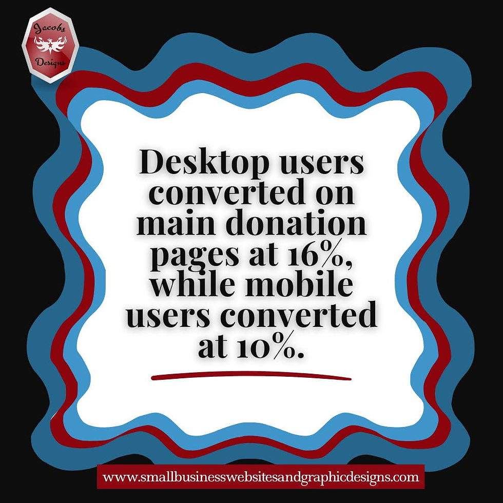
This matters because the website still carries most of the conversion work. M+R’s 2025 website benchmarks found that 53% of nonprofit website visits came from mobile users, but desktop users still drove 70% of donation revenue, with an average desktop gift of $145 compared with $76 on mobile. That tells us something important: getting the click is not the finish line. What happens after the click still shapes whether that visit turns into action.
If this feels like a bigger problem than just “fixing a few graphics,” that is because it usually is. In The Biggest Digital Challenges Nonprofits Face (And How To Fix Them), I break down the larger trust, website, messaging, and capacity issues that often sit underneath weak digital results.
So if your nonprofit social media graphics are getting attention but your website is not converting as well as you hoped, this post is for you.
I am writing this from the perspective of someone who works on both sides of the problem: website design and social media campaign graphics. And from that angle, I can tell you this clearly — the strongest social graphics are not just attractive. They are aligned. They prepare the visitor for what comes next, and they help the website feel like a natural continuation of the same campaign, message, and next step.

Key Takeaways
Social graphics influence expectations before the click, and your website has to continue that same message clearly.
Misalignment between social graphics and landing pages creates friction, confusion, and lower conversions.
Strong nonprofit social graphics that drive website conversions usually match the landing page in message, visual tone, and call to action.
A graphic should not just get attention — it should prepare the visitor for the page and the action you want them to take.
Donation, signup, volunteer, and event pages each need slightly different graphic and CTA strategies.
Better alignment does not mean more design work for the sake of design. It means more intentional visual communication.
Table of Contents
Why Visual Alignment Matters More Than Most Nonprofits Realize
What Misalignment Looks Like In Real Life
Why This Disconnect Hurts Website Conversions
What Good Alignment Between Social Graphics And Website Pages Looks Like
How To Align Nonprofit Social Graphics With Website Conversions
How To Create Social Graphics That Match Nonprofit Website Goals
Common Design Mistakes That Quietly Hurt Conversions
How To Audit Your Current Social Graphics And Landing Pages
What To Measure After You Improve Alignment
👉Why Visual Alignment Matters More Than Most Nonprofits Realize
A social graphic does more than fill space in the feed.
It sets expectations.
Before someone even clicks, the graphic is already telling them something about your organization. It is signaling tone, urgency, professionalism, trust, emotion, and next-step intent. That first impression matters because the audience is making a split-second judgment about whether the message feels clear enough and credible enough to follow.
For nonprofits, that trust layer matters even more. Charity Navigator says that sharing results promotes transparency and builds trust with donors and beneficiaries. Candid has also pointed to research showing that transparent nonprofits tend to be stronger organizations and that organizations earning a GuideStar Seal of Transparency averaged 53% more in contributions the following year in one study. So when we talk about nonprofit visual consistency for better conversions, we are not just talking about aesthetics. We are talking about trust signals.
That is why social graphics and landing page consistency matter so much. The visitor should feel like the website belongs to the same campaign they just clicked on. Same message. Same tone. Same emotional direction. Same call to action.
When that continuity exists, the journey feels intentional. When it does not, the brain pauses.
And in conversion work, those little pauses matter.
✍What Misalignment Looks Like In Real Life
Misalignment is not always dramatic. Most of the time, it is subtle.
That is part of why it hurts conversions quietly.
Here are a few real-life examples of what misalignment often looks like:
The Social Graphic Promises One Thing, But The Page Focuses On Another
You post a volunteer recruitment graphic, but the page someone lands on starts by asking for donations. Or you run a campaign about a specific program, but the landing page opens with a broad “about us” section instead of continuing the campaign message.
The Visual Tone Changes Too Sharply After The Click
Your social media graphic feels warm, clear, and focused, but the landing page looks cluttered, outdated, or visually disconnected. The fonts change. The color emphasis changes. The imagery feels generic. The message hierarchy falls apart.
The Call To Action Changes
The graphic says “Join Us,” but the page says “Learn More.” The post encourages people to register, but the page leads with a donate button instead. That kind of mismatch creates hesitation.
The Social Graphic Is Clear, But The Page Is Overloaded
This one is especially common. The graphic is focused on one message, but the page includes five competing actions, three sidebars, too much text, and no obvious next step.
When people ask how social media graphics affect nonprofit website conversions, this is the answer: the graphic helps shape the visitor’s expectation. The page either confirms that expectation or disrupts it.
🔎Why This Disconnect Hurts Website Conversions
The biggest reason misalignment hurts conversions is simple: it increases friction.
Nielsen Norman Group defines conversions as desired actions on your website, and their research on forms and cognitive load is really useful here. They note that reducing user effort improves completion and that structure, transparency, clarity, and support help lower cognitive load. In plain language, the easier and clearer you make the path, the more likely people are to finish it.
Misalignment creates the opposite experience.
It makes people work harder to answer questions like:
Am I in the right place?
Is this the same campaign I clicked on?
What am I supposed to do now?
Why does this page feel different from the post?
Is this organization as clear and trustworthy as I thought?
That extra mental work breaks momentum.
And momentum matters because social media traffic is often fragile. The person who clicked is already giving you a second chance with their attention. If the page feels confusing, mismatched, or off-brand, that attention disappears fast.
This is why social graphics that improve donation and signup conversions are not just “pretty.” They are strategically consistent.
👀What Good Alignment Between Social Graphics And Website Pages Looks Like
Good alignment does not mean making the social graphic and the landing page look identical.
It means making them feel connected.
Here is what strong alignment usually looks like:
Social Graphic Element | Website Element It Should Support |
Headline | landing page headline or first message block |
CTA | page button or next-step action |
Color Emphasis | page visual hierarchy |
Imagery Style | page banner or supporting imagery |
Campaign Tone | page copy tone and emotional direction |
When social graphics are aligned well with website pages, a visitor should feel three things almost immediately:
Recognition – “Yes, this is what I clicked on.”
Clarity – “I understand what this page is asking me to do.”
Confidence – “This feels trustworthy and consistent.”
That is what nonprofit branded graphics for website traffic and conversions are supposed to help create.
A well-aligned campaign usually includes:
the same core message in both places
the same main audience focus
the same primary CTA
a similar visual tone
a page layout that supports the action promised in the post
Good alignment is not decorative. It is directional.
⚖How To Align Nonprofit Social Graphics With Website Conversions
If you want to know how to align nonprofit social graphics with website conversions, start with the website goal — not the graphic.
That is where a lot of people accidentally reverse the process.
They make the graphic first, then try to find a page that “kind of” fits it.
The stronger approach is this:
Step 1: Decide The Website Goal
What is the real outcome?
donation
event registration
volunteer signup
email signup
application
inquiry
resource download
Step 2: Clarify The Page Message
What is the promise or offer on the page?
What action should the visitor take?
What emotional tone does the page need?
Step 3: Build The Graphic Around That Goal
The social graphic should support the same message and same action.
Step 4: Keep The CTA Consistent
If the graphic says “Register Now,” the page should not suddenly shift into a softer or unrelated ask.
Step 5: Simplify The Journey
One campaign. One message. One main CTA. One focused destination.
That process can be summarized like this:
Website goal → landing page message → social graphic concept → caption → CTA
That is how to connect nonprofit social media design with website action without making the process feel overly complicated.
🎯How To Create Social Graphics That Match Nonprofit Website Goals
Different website goals need different visual support. That is where alignment becomes practical.
Website Goal | Best Graphic Focus | Best CTA Style |
Donation | impact, urgency, trust | Donate Now |
Volunteer Signup | role clarity, community, purpose | Sign Up / Learn More |
Event Registration | date, value, urgency | Register Now |
Email Signup | useful value, clarity, incentive | Join the List |
Donation Pages
Donation graphics need clarity and confidence. The visual should reinforce impact, trust, and the reason the gift matters now.
M+R’s 2025 benchmarks show that 76% of nonprofits offer PayPal on their main donation page, 47% offer Apple Pay, and 40% offer Google Pay. That is a strong reminder that conversion is shaped by experience, not just message. If your social graphic asks people to give, the page needs to make giving feel easy.
Volunteer Pages
Volunteer graphics should feel specific and approachable. Community photos, role clarity, and a clear statement of impact usually work better than overly broad “get involved” visuals.
Event Registration Pages
Event graphics should emphasize relevance, timing, and next step. If the page is about registering, the social graphic should not act like a generic awareness post.
Email Signup Pages
These are often under-designed. If you want someone to join your email list, the graphic should make the benefit obvious. What are they getting? Updates, resources, insider access, opportunities, event reminders?
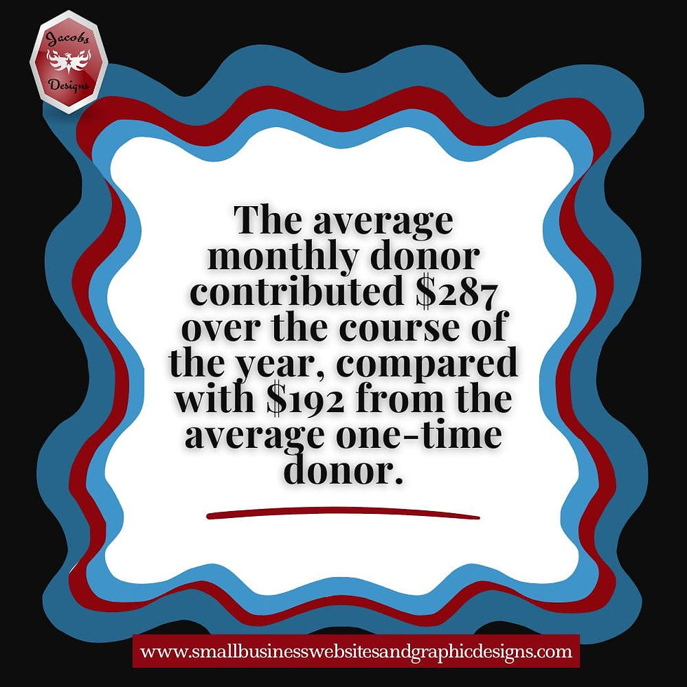
This is also where small conversion nudges matter. M+R found that 78% of nonprofits use language or a feature on their main donation form to encourage recurring gifts, and 41% use a recurring upsell lightbox. That shows how much small design and wording choices can shape action after the click
❌Common Design Mistakes That Quietly Hurt Conversions
A lot of low-converting campaigns do not fail because the design is bad. They fail because the design is disconnected.
Here are some of the most common mistakes:
using beautiful graphics with weak message hierarchy
designing for the feed without thinking about the landing page
letting the social caption, graphic, and page each say something slightly different
using too many visual elements so the main CTA gets buried
keeping everything “on brand” but not focused enough for the campaign
changing tone too sharply from social to website
sending traffic to a page that does not visually resemble the campaign at all
This is why nonprofit social media graphics and landing page consistency matter so much. It is not about perfection. It is about reducing confusion.
💡How To Audit Your Current Social Graphics And Landing Pages
If you want to improve this without overcomplicating it, audit one campaign at a time.
Pick a recent campaign and walk through the journey step by step:
Look At The Social Graphic
What message does it communicate first?
What action does it imply?
What tone does it create?
Look At The Caption
Does it support the same message?
Is the CTA clear?
Does it match the page destination?
Look At The Landing Page
Does the page headline confirm the click?
Does the design feel visually connected?
Is the next step obvious?
Is the page too cluttered for the action you want?
A simple audit checklist looks like this:
Quick Alignment Audit
Does the page look like it belongs to the same campaign?
Does the CTA stay consistent from post to page?
Does the visitor immediately know they are in the right place?
Is the page focused enough to support the intended action?
Does the design reduce friction or add it?
That is one of the most useful ways to turn nonprofit social media clicks into website action.
⌛What To Measure After You Improve Alignment
Once you improve alignment, you need to look at whether the results actually change.
Start with social-side metrics:
clicks
click-through rate
saves
shares
engagement on campaign posts
Then look at website-side metrics:
landing page visits from social
bounce trends
form starts
donation page visits
registrations
completed conversions
LinkedIn’s guidance around conversion tracking is useful here because it emphasizes looking beyond reach and engagement into what those actions actually lead to on your website. That is the right mindset here too. Better design alignment should not just look nicer. It should support better outcomes.
The most useful comparison is often a simple before-and-after:
same campaign type
same audience
clearer graphic-to-page alignment
stronger CTA consistency
better landing page focus
If the journey got smoother, the results should usually move in the right direction too.
And if your team is still relying too heavily on likes or follower growth to judge success, it helps to step back and look at why nonprofit social media engagement matters more than follower count and what to track instead.
📌How This Fits Into A Smarter Nonprofit Content Strategy

Good graphics are not separate from strategy.
They are part of strategy.
They support trust, attention, message clarity, website traffic, and conversions. They are not just a design layer you add after everything else is decided.
This is also why good graphics are not separate from content. Content earns the click. Visuals support the message. The website carries the action. When those parts are treated like one connected system, things work better.
Of course, strong graphics are only part of the picture. The content itself still has to give people a real reason to click, which is exactly what I cover in Nonprofit Social Media Content That Drives Website Traffic And Conversions.
If your team is still stretched across too many platforms and trying to create visuals for everything at once, it becomes much harder to build graphics that are truly aligned with your website goals. That is why starting with a smarter nonprofit social media strategy for small teams matters first.
That is the bigger lesson here.
Better conversions usually do not come from one magic graphic or one clever button. They come from better alignment between:
the campaign goal
the message
the visual
the CTA
the page experience
That is the kind of design thinking that helps nonprofit social graphics drive website conversions more consistently.
🌟Conclusion
If your nonprofit social graphics are getting attention but your website is not getting enough action, the issue may not be the traffic itself. It may be the disconnect between what the graphic promises and what the website actually delivers. The strongest social graphics do more than attract clicks — they prepare people for the page, reinforce trust, and make the next step feel like a natural continuation of the same message. When your social visual, website page, and call to action all feel aligned, the conversion path gets simpler, clearer, and more effective.
✨FAQs
How Do Social Media Graphics Affect Website Conversions?
They shape expectations before the click. A strong graphic can build trust, clarify the message, and prepare people for the next step. A mismatched graphic can create confusion that hurts conversion.
Why Should Nonprofit Social Graphics Match Landing Pages?
Because consistency reduces friction. When the post and landing page feel connected, visitors are more likely to feel confident that they are in the right place and ready to act.
What Should Nonprofit Social Graphics Include To Improve Conversions?
A clear message, focused CTA, visual consistency, and alignment with the landing page goal.
What Causes Low Website Conversion From Social Media Traffic?
Common reasons include weak CTA alignment, mismatched visuals, cluttered landing pages, unclear message hierarchy, and too many competing actions.
How Can Nonprofits Improve Social Media Conversion?
Start with the website goal, build the graphic around that goal, keep the message consistent, and make the landing page feel like a continuation of the same campaign.


Comments